31. Quiz 4
Reflect
QUESTION:
What needs to be added to make sure the context is clear?
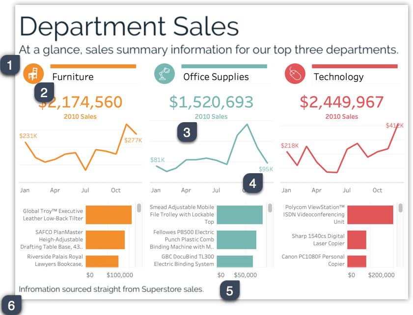
The examples shared in the course all presented a subtitle with more detailed explanatory text, clear axes, information in the footer, and details where appropriate. In this exercise students should apply what they learned about annotations in the previous examples to clear up any uncertainty here or simply add context so users can navigate the dashboard with confidence.
ANSWER:
A few helpful annotations to be added are…
- Subtitle summarizing the dashboard
- Helpful column names mentioning a category
- Text stating what the big numbers refer to
- Labels over the line to make the numbers more specific
- Axes on the bar charts so the user can see the range of values
- A footer mentioning where the data comes from
- Designer
Who originally created the dashboard - Data source
Where is the data coming from - Refresh schedule
When was the data last refreshed and when will it be refreshed next. - Date range
Of the data fed into this dashboard, how much time does it span? - Calculation information
Are their any calculations that could be confusing to someone new to this tool. If so, it’s helpful to reference resources where the users can learn how the measures are calculated and/or why it’s done this way. - Legend to say what the darker grey bars indicate (optional)
Color encodings without clear labels need a legend in order for users to understand their meaning. - Who to contact with questions
If possible provide a sort of support number or contact people can reach out to with questions
Solution for Quiz 4